Blue Sea Products.
Branding and Packaging Design.
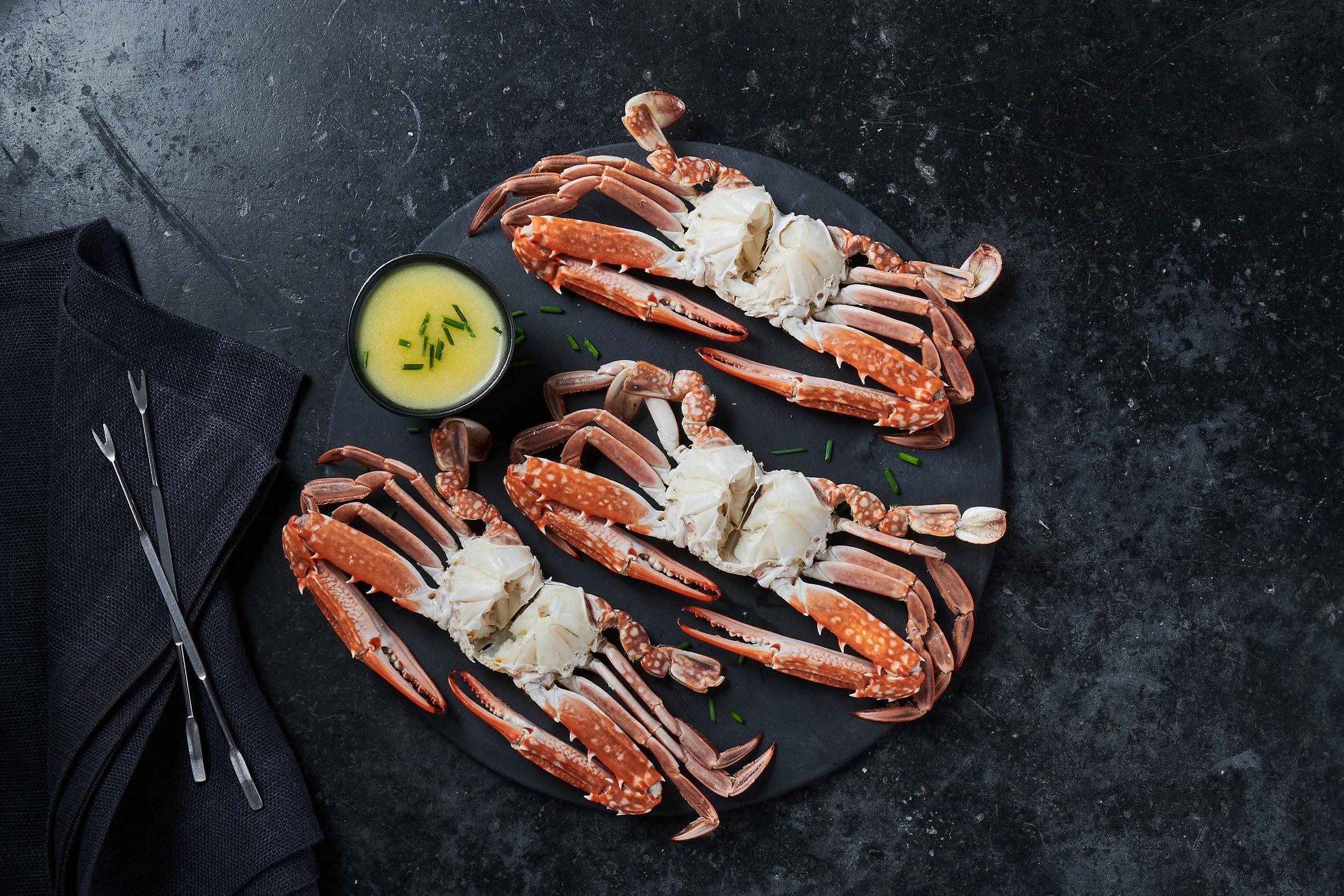
Blue Sea Products branding and packaging design project for New Jersey based seafood company. Complete rebrand including logo, visual identity, photography direction and photoshoots, packaging systems for 30+ products ranging from commodity to premium lines, creating a cohesive brand architecture across diverse product tiers, and environmental/food expo design.
Disciplines
Branding / Packaging / Collateral / Graphic Design
Studio: Rhythm
Creative Direction, Art Direction: Markus Wreland
Account Director: Blake Hoss
Photography:SP Studios


Thirty-plus products. One tired brand. Blue Sea had the distribution but their packaging looked like it hadn't evolved since flip phones were cool.
We gave them a complete reset—logo, visual identity, photography direction, and a packaging system that works as hard as they do. Commodity products that don't look cheap. Premium lines that actually feel premium. A brand architecture that makes sense across the entire range.
From grocery aisles to food expos, the brand now shows up with clarity and confidence. Because when you're moving that much product, looking forgettable isn't an option.
Strategic systems. Premium presence. Commodity to luxury, handled.