Nanaimo.
Tourism Branding.
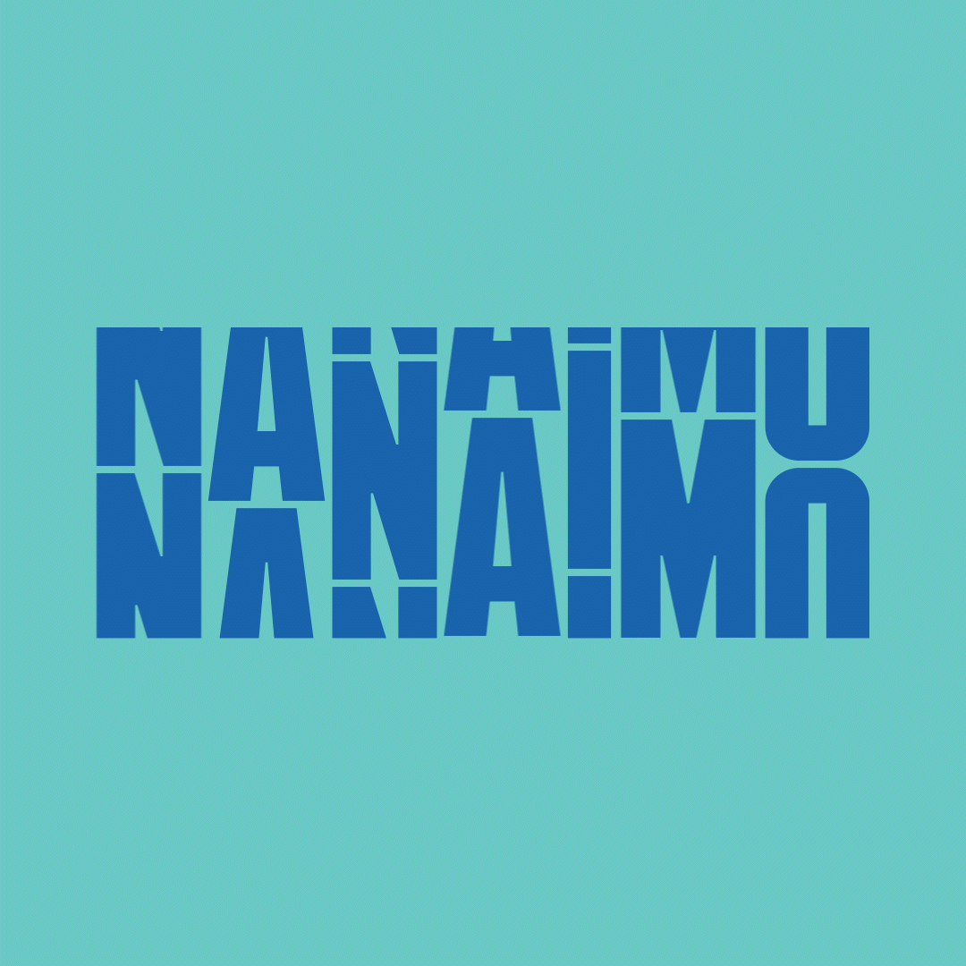
Tourism Nanaimo rebrand and visual language project for Vancouver Island city. Complete brand identity including "ever evolving" logo system, design principles, and visual language that pairs urban expression with tranquil nature, positioning Nanaimo as raw, labelless, and impossible to categorize.
Disciplines
Branding / Logo / Typography / Collateral / Graphic Design
Studio: Partners & Hawes
Creative Direction, Art Direction, Design: Markus Wreland
CD:Chris Moore
Video & Photography:Andi Wardrop
Motion:Ira Hardy
Animation & On-set AD:Megan Susara
Account Director/ Project Manager: Kaya Wiggins, Shannon Cherry
Nanaimo refused to be put in a box. This city doesn't fit the "quaint coastal town" cliche—it's urban edge meets wild nature, big city attitude with island roots. They needed a brand as impossible to pin down as the place itself.
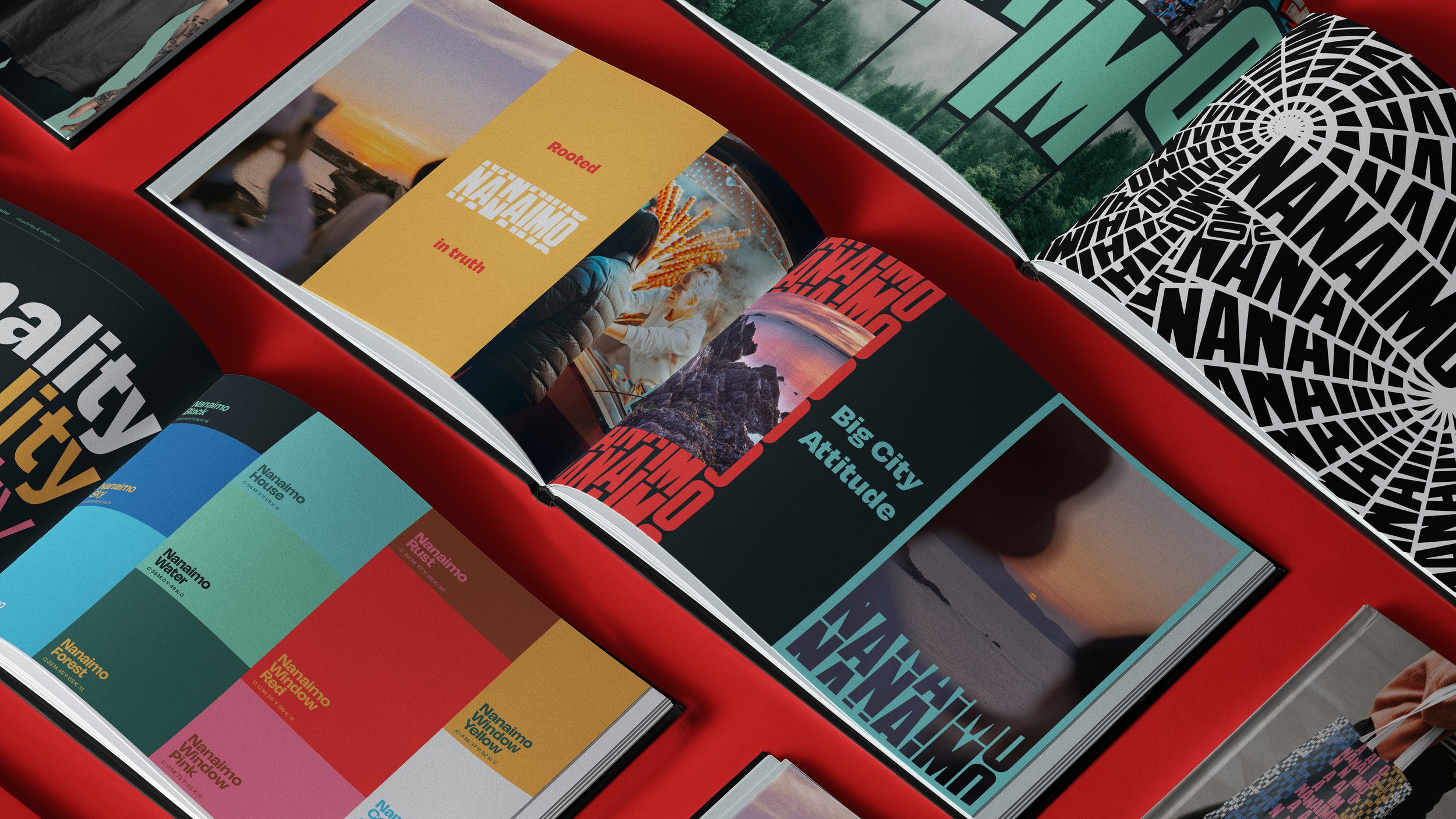
We created an "ever evolving" logo system—constant framework, infinite expressions. Just when you think you've got Nanaimo figured out, it shifts. The visual language pairs urban grit with tranquil landscapes, honest docu-style photography with epic nature shots, and messaging that's as clever as it is unapologetic.
A palette pulled straight from the local landscape. A brand rooted in truth, adapting and surprising at every turn.
Raw. Labelless. Proudly impossible to categorize.