Big Slice Apples.
Packaging & Product Branding.
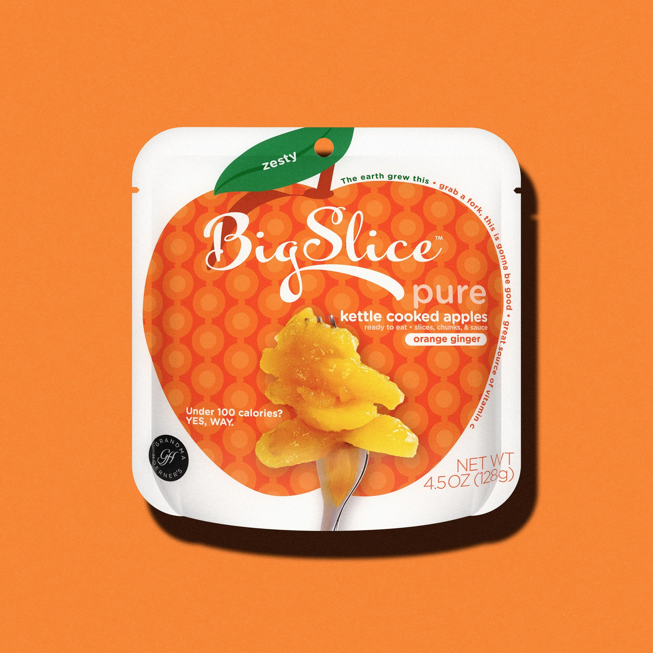
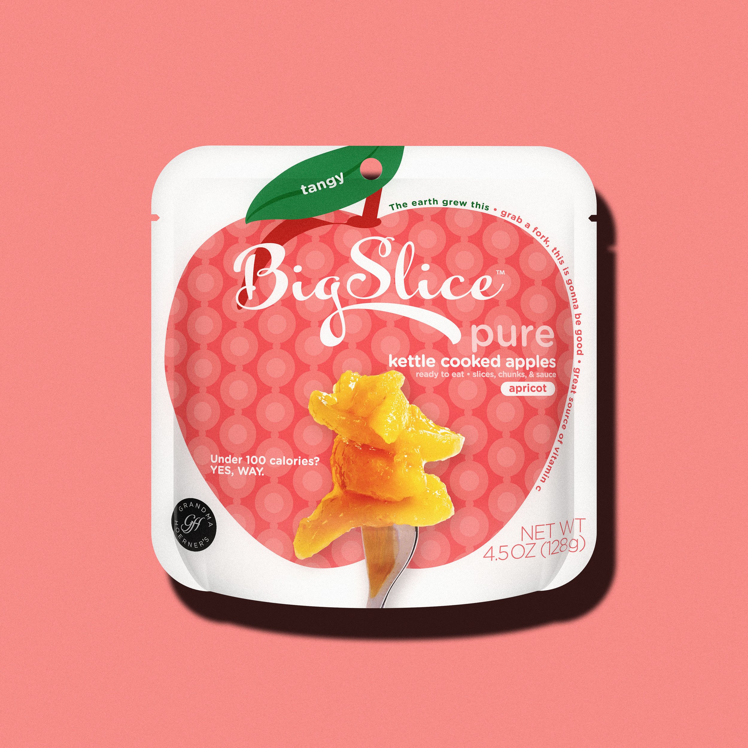
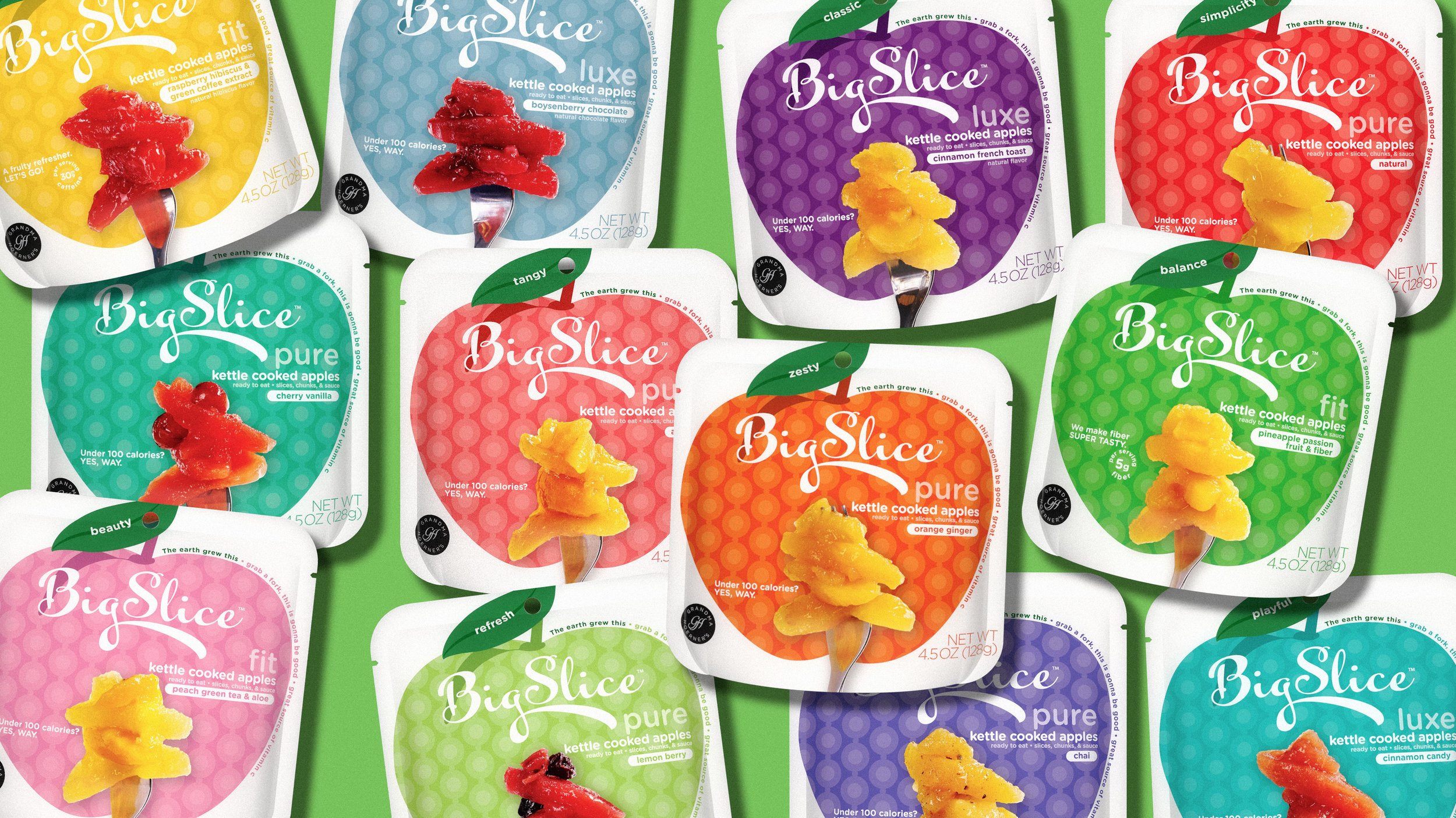
Big Slice Apples packaging and product branding project for Grandma Hoerner's innovative apple product line. Market-first flexipack packaging system replacing traditional glass jars, with cohesive visual identity across 20+ flavors that educated consumers and revolutionized the canned fruit category.
Disciplines
Branding / Typography / Art Direction / Packaging
Design Firm: Rhythm
Creative Direction & Design: Markus Wreland
Account Director: Blake Hoss
Photography:Armstrong Pitt Studios

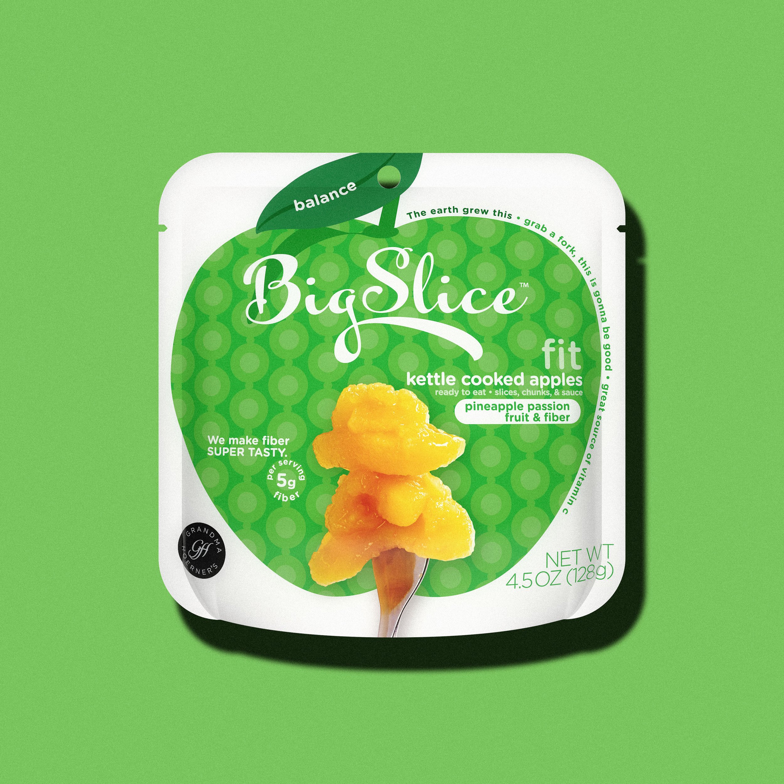
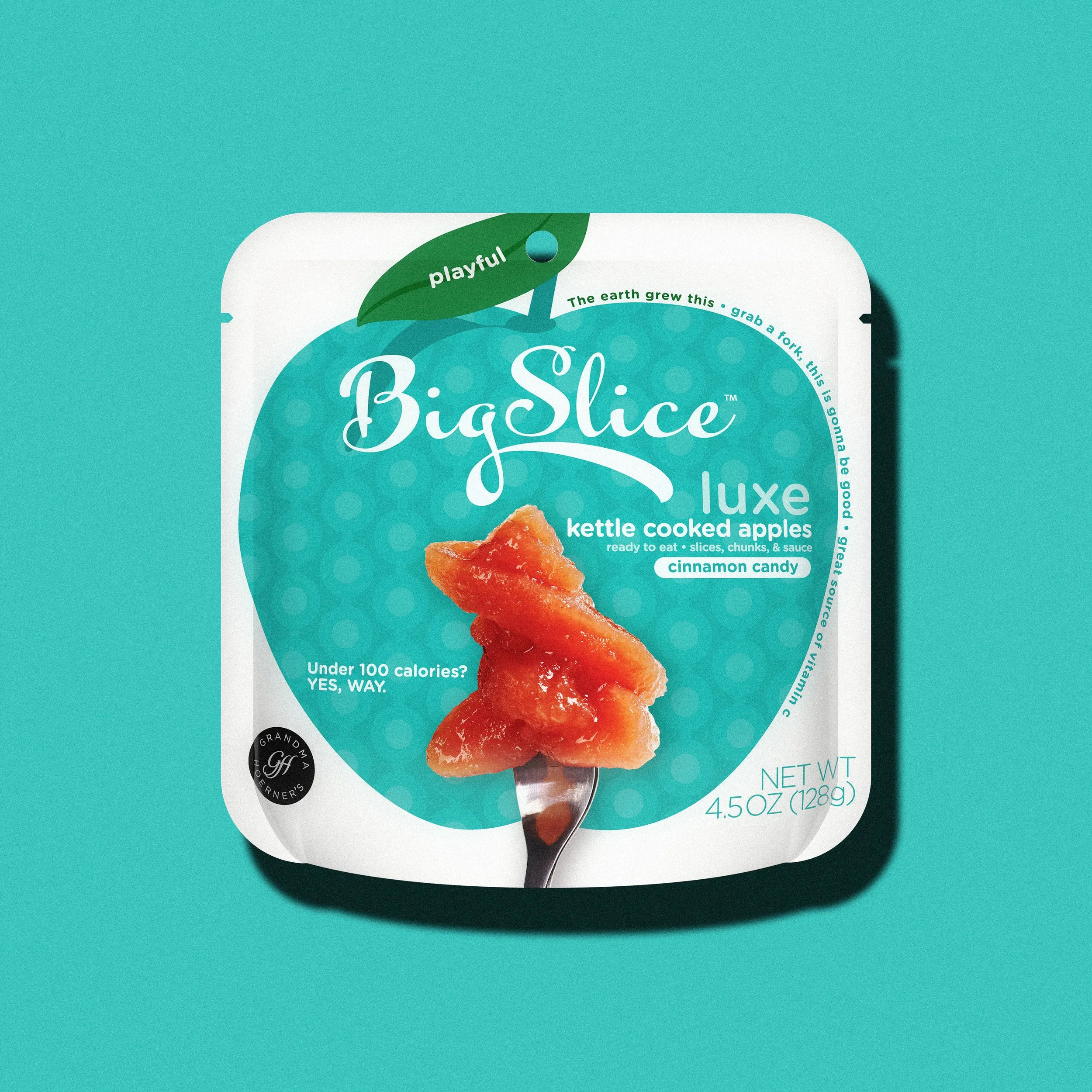
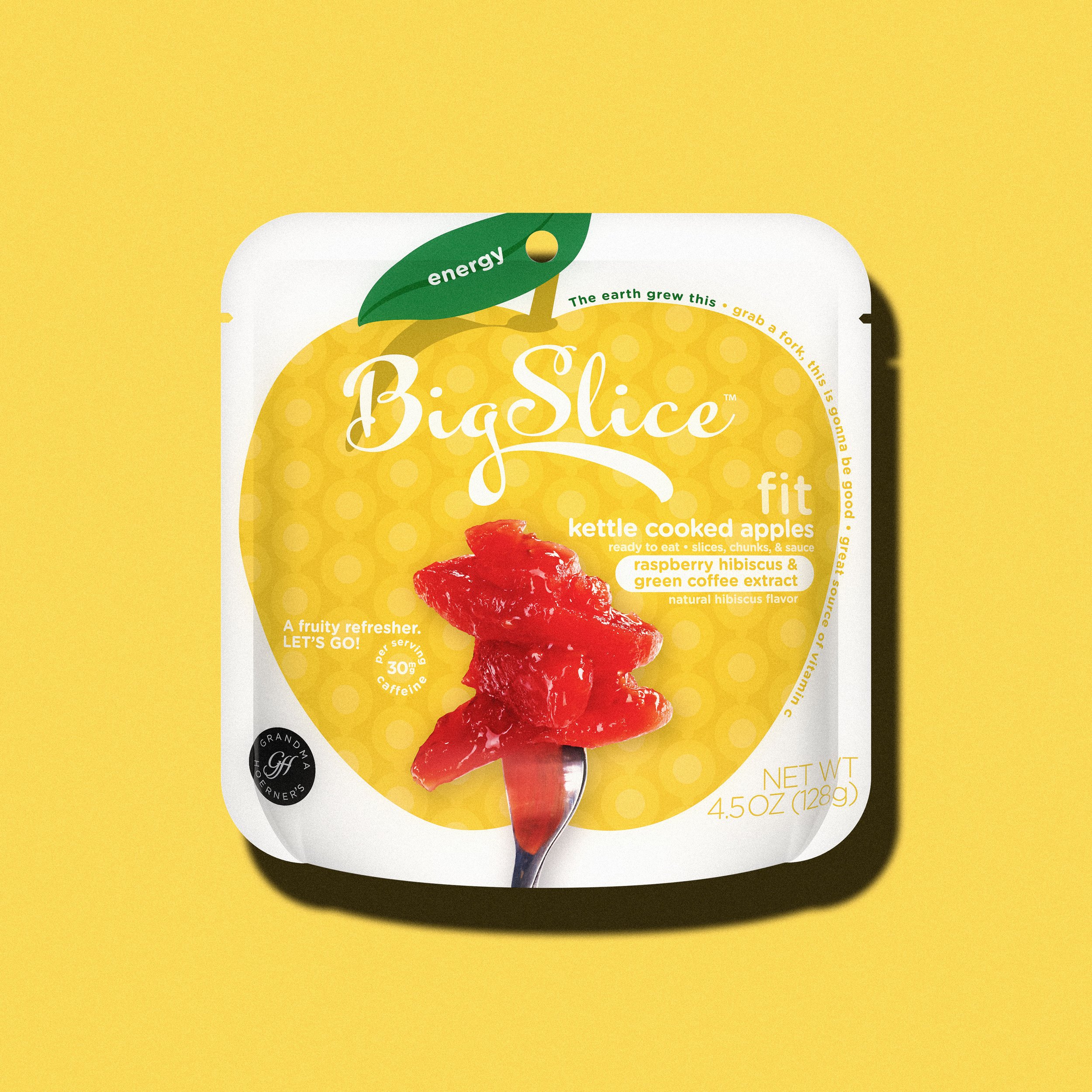
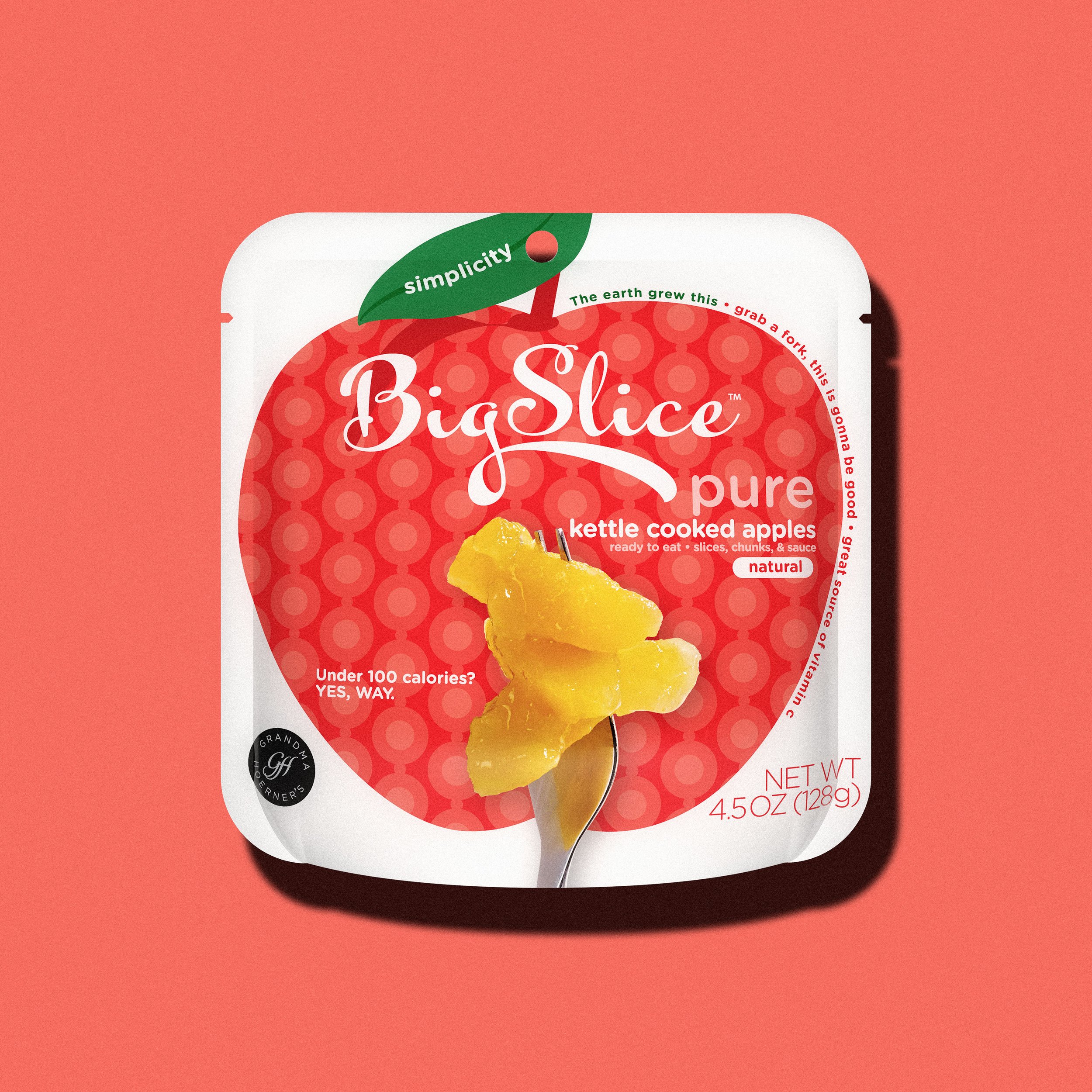
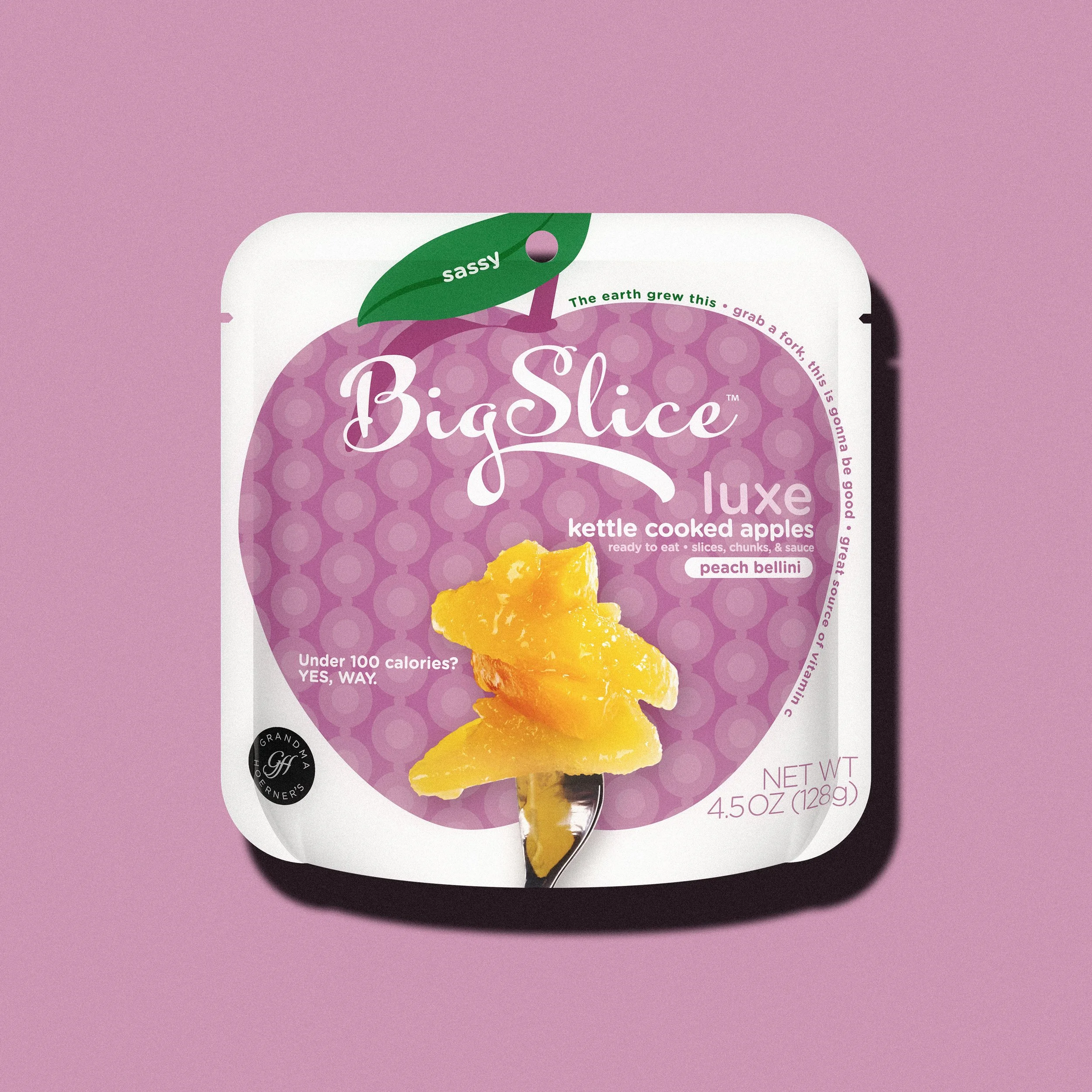
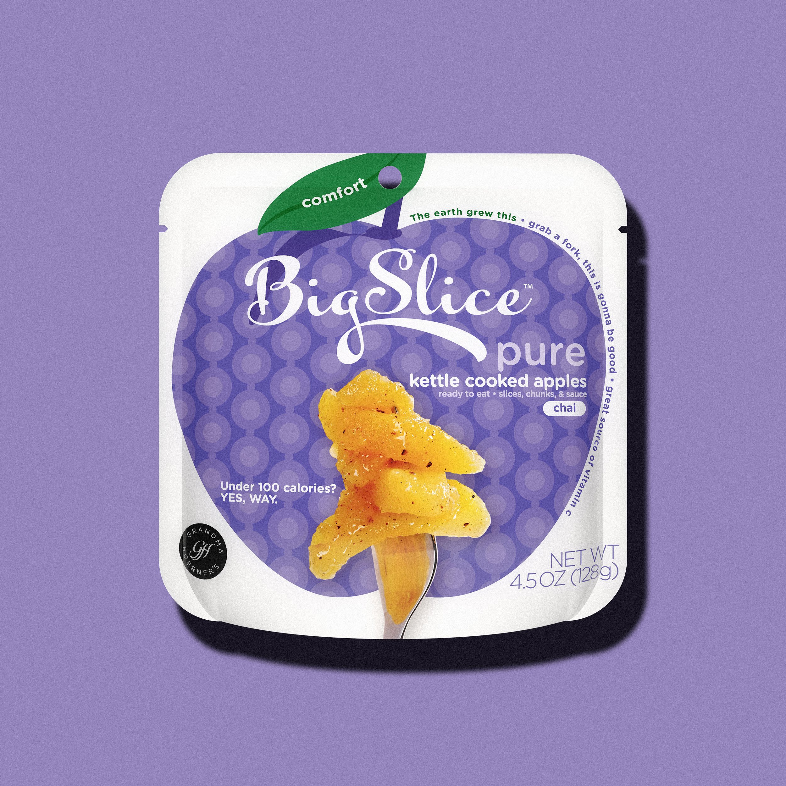
Big Slice Apples by Grandma Hoerner's was about to do something no one in the category had done—ditch glass jars designed for baking and introduce flexipack pouches for on-the-go fruit snacks. Revolutionary? Yes. Also risky as hell when consumers don't know what they're looking at.
We created a new brand and a packaging system that worked across 20+ flavours while solving a bigger challenge: educating new and existing shoppers on what this product is and how to use it. Bold, cohesive design that commands attention on shelf and guides people through something completely new.
This completely disrupted the market. They paved the way for an entire category shift. Everyone else followed.
Market-first innovation. Shelf dominance. Category revolution.