
Kampen.
Music branding & album artwork.
Kampen music branding and album artwork for the Swedish, Gothenburg-based folk punk band. Complete visual identity including hand-crafted logo, custom hand lettering, and illustration created with brush and ink in tribute to DIY punk culture and underground music scene aesthetics.
Disciplines
Branding / Typography / Hand Lettering / Illustration
Creative Director: Markus Wreland
Client: Kamel Records
Client: Kampen on Spotify
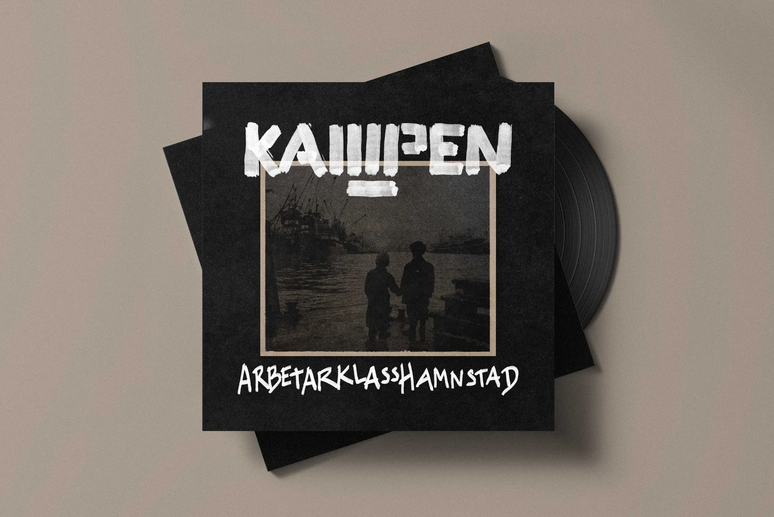
Kampen is a folk punk band from Gothenburg, Sweden, rooted in DIY culture and underground energy. Corporate design templates? That would probably be very punk, but not an option here. They needed a visual identity as raw and honest as their music.
We went full analog. Logo crafted with brush and ink by hand. All typography hand-lettered. Album artwork built the old-school way—no shortcuts, no digital polish. A tribute to the DIY punk ethos where authenticity beats perfection every time.
A b(r)and that looks like it sounds.
Hand-crafted rebellion. No digital shortcuts. Pure DIY energy, and a whole lot of middle fingers.


Merch, Merch, Merch.


